Overview
CUDOS Ventures
- UI / UX, WordPress Web Design
- 2020
-
Bespoke Web Design
-
Custom WordPress
-
Landing Page System
-
Customised Admin
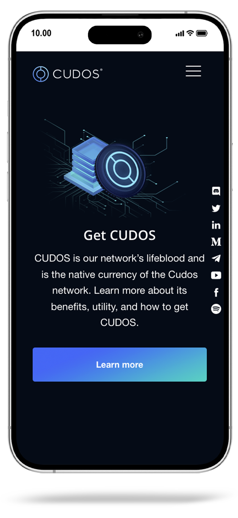
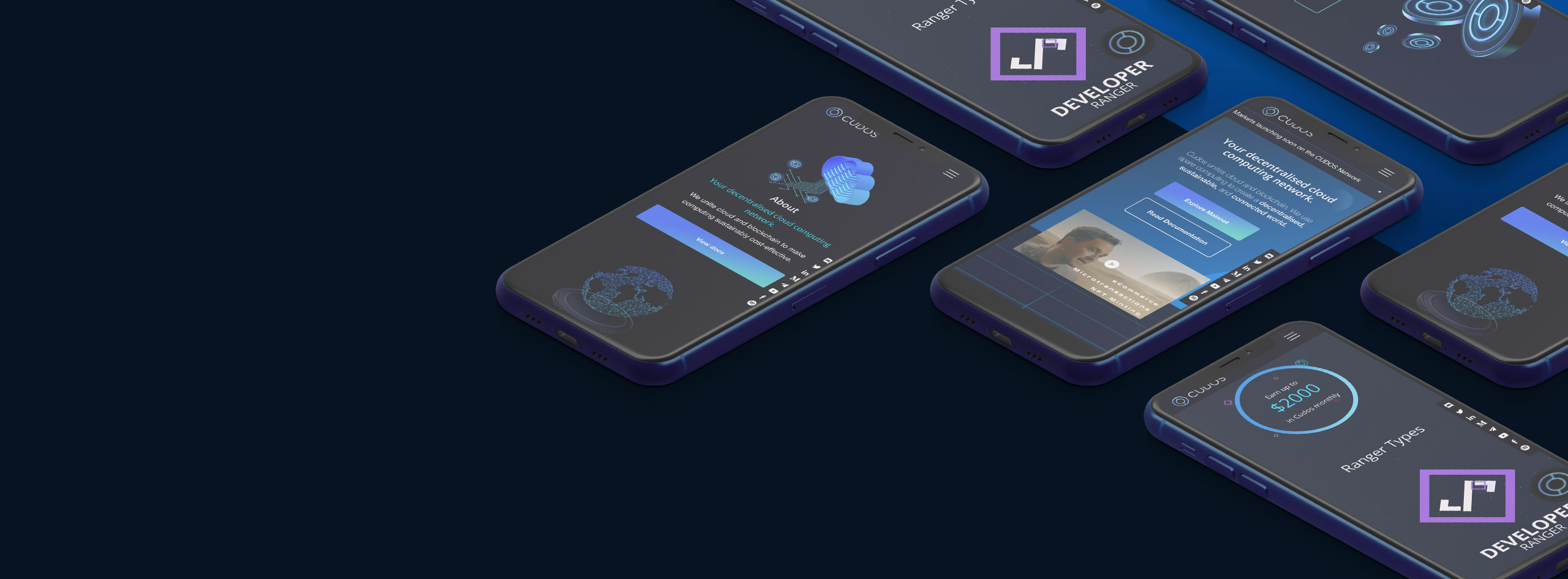
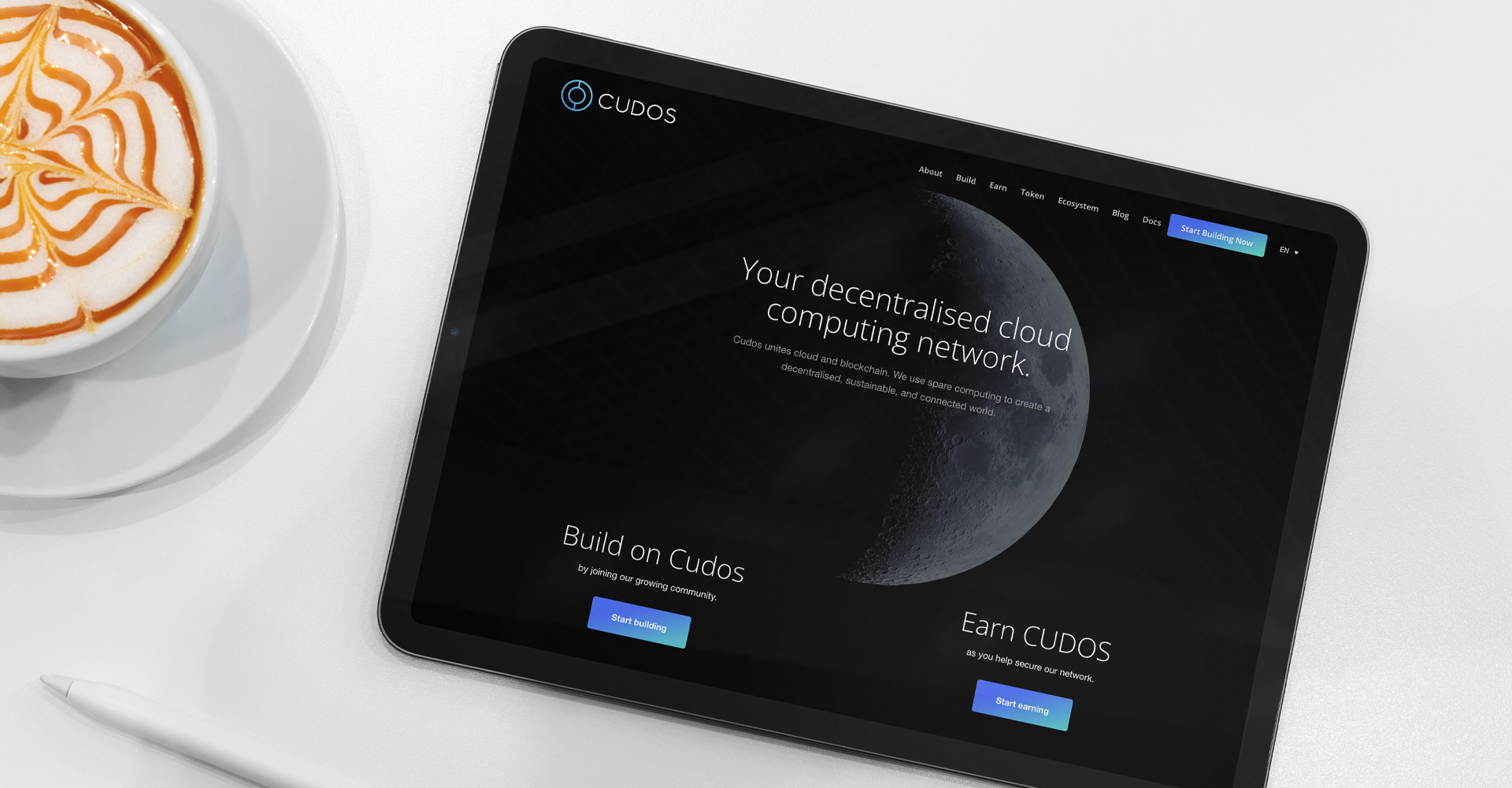
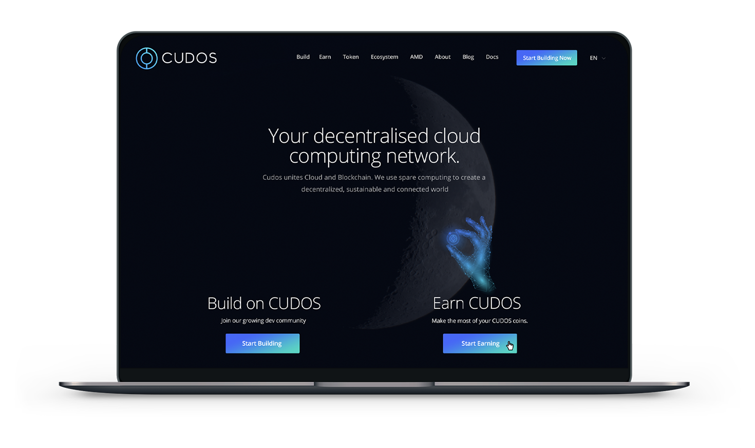
Cudos brings together cloud and blockchain technologies to create a decentralised, sustainable, and interconnected world. They approached us to redesign their main website and sub-divisions of the company. Read more on how we delivered the project below.
Client Brief
Cudos recognised the exceptional quality of work delivered by Bond Media for one of their suppliers, and it was on this basis that they approached us with a request to revamp their website.
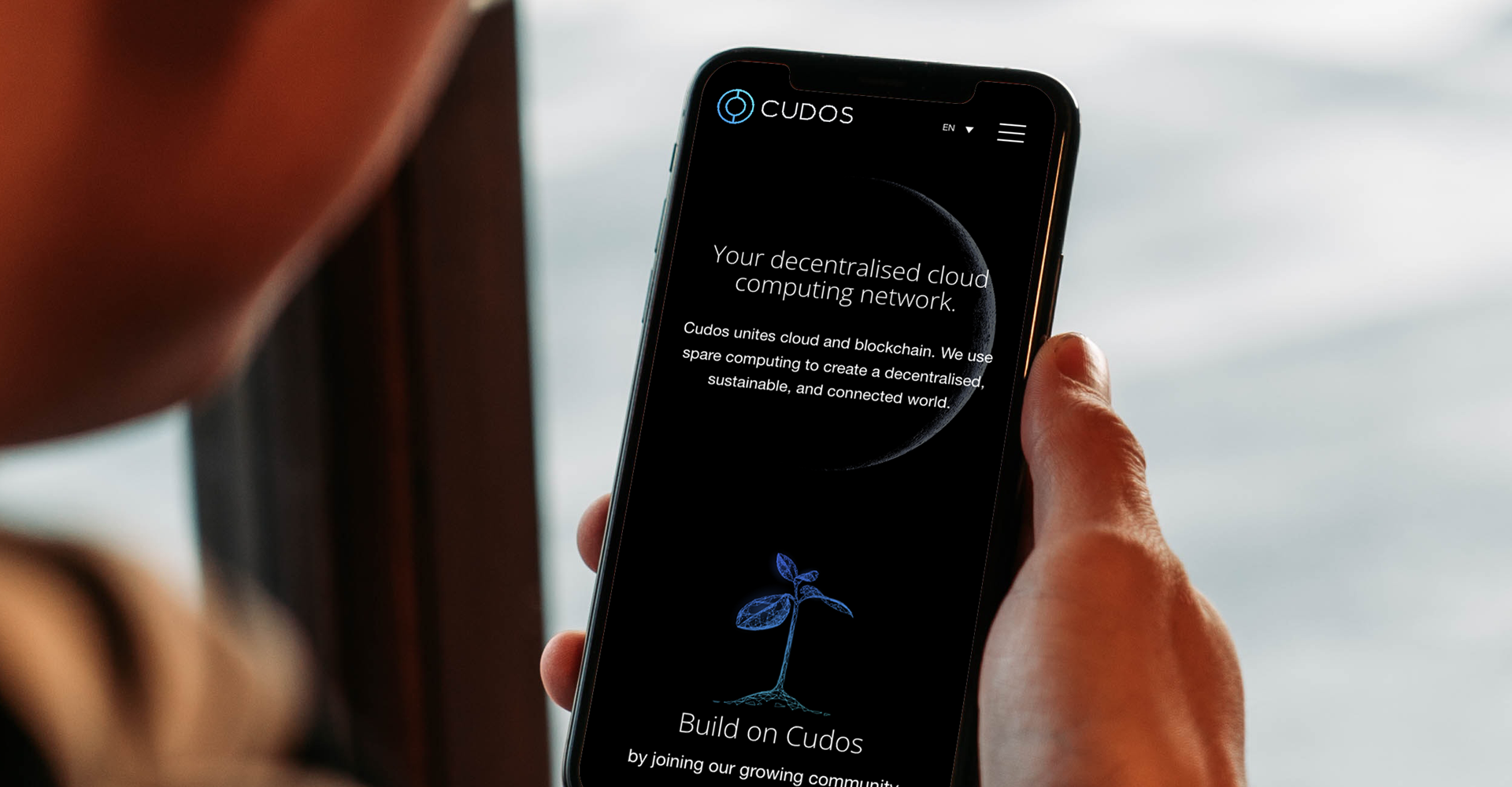
The key requirements for this project included a clear and intuitive navigation system, multi-lingual capabilities, and a design that would accurately reflect their brand image while creating a powerful user experience for their target audience.
Our team was excited to take on the challenge of developing a website that would effectively showcase Cudos’ unique offerings and engage their community in a meaningful way. To achieve this, we worked collaboratively with their team to ensure that all aspects of their brand and business were accurately represented on the website.
Project Overview:
Lead time: 8 weeks
Sector: Crypto
Target Type: B2B & B2C
Demographic: Crypto Enthusiasts
Website Goals: Clean Design, Easy to use Navigation
Services: Web Design, Web Development, WordPress
Key Features:
Full multilingual content management
Using WordPress a popular content management system (CMS) we gave Cudos the ability to create and manage the website’s content easily. With full multilingual content management, Cudos is able to create content in multiple languages, manage translations, and ensure that the website is accessible to a global audience.
Customised icons and animations
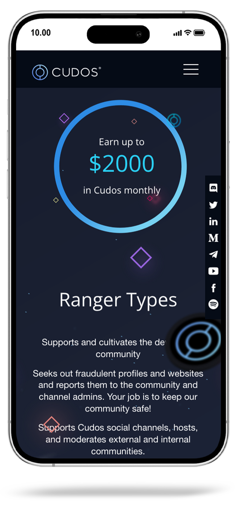
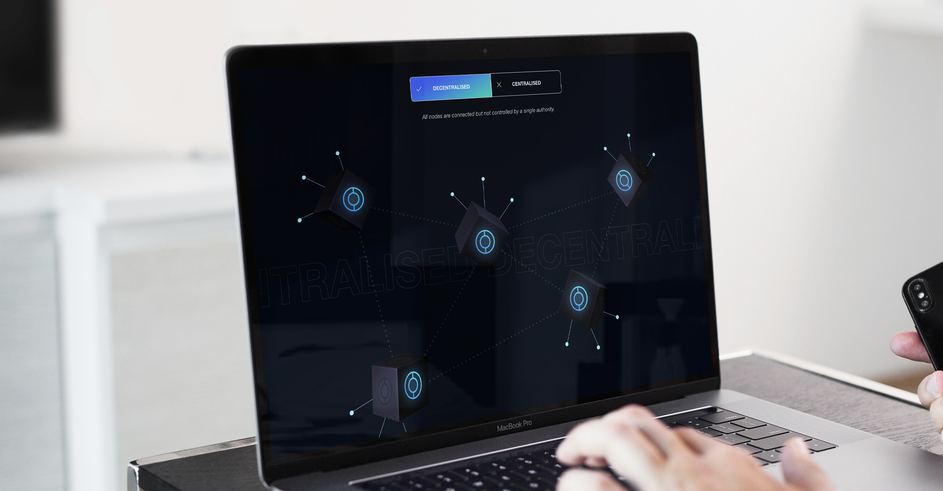
Customised icons and animations can be used to impress the audience and achieve the desired impact on a website. In the case of Cudos, with the goal of wowing the audience, customised icons and animations were used.
News ticker
This feature enabled Cudos to highlight important announcements in a more effective manner. This new ticker has been designed with user experience in mind, allowing for easy access to essential information while not overwhelming the user. This feature is just one of many steps that we took to enhance its user experience.
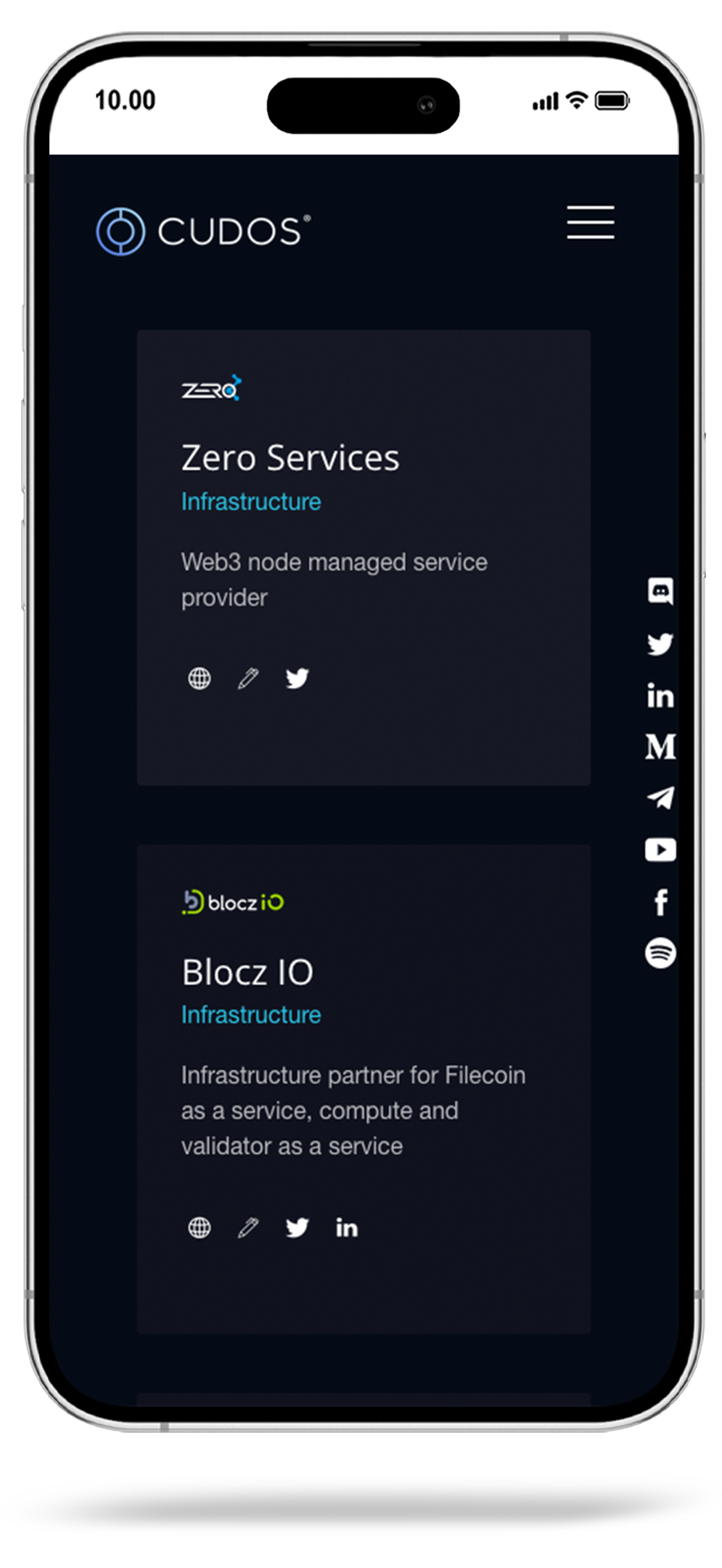
Portfolio system for partners
This feature allows Cudos to showcase all of the businesses and organisations that they collaborate with. This new feature includes filters that allow users to view partners by different categories, making it easy for them to find the information they need. The partner portfolio system is fully manageable by Cudos, allowing them to easily update and add new partners as they join.
Landing page builder
This new feature enables the Cudos team to provide users with customised and targeted information, improving engagement and overall user experience. The landing page builder is easy to use, and after training, they had free reign to create pages as and when needed. The simplicity of the admin area means that no programming or HTML skills are required. They simply upload images, videos and type text, and the page comes to life.
Vimeo integration
The Vimeo integration wee built for Cudos allows videos to be uploaded directly to Vimeo and streamed into website pages, providing a seamless and high-quality video experience for users. With this new integration, Cudos can easily embed Vimeo videos onto their website pages without the need for complex coding or technical expertise. The integration is user-friendly, making it easy to upload and manage videos directly from the Vimeo platform.
The Solution
The success of the Cudos project was due to great collaboration between their team and ours at Bond Media. We had clear communication and a shared understanding of the goals, resulting in an efficient workflow. Our team created a website that accurately reflected their brand and resonated with their audience. The project was completed on time and within budget, receiving overwhelmingly positive feedback. This project showcased the importance of effective collaboration and communication. If you need a solution like we delivered for Cudos, please get in touch and book a discovery call.
Colour Palette
When designing the website for TRONYX, we adhered to the brand's identity by maintaining a clean and straightforward color palette. This approach allowed the product photography to seamlessly incorporate the brand's colours into the site's visual appeal.

Typography
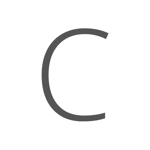
Upon careful examination of the brand guidelines and a thorough understanding of the intended messaging, we proceeded to assess the typography employed in the website design. Subsequently, we made the decision to transition to a web-safe font that aligns with the brand's identity and messaging.
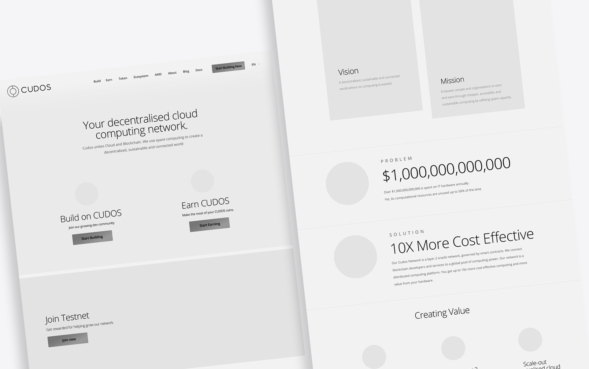
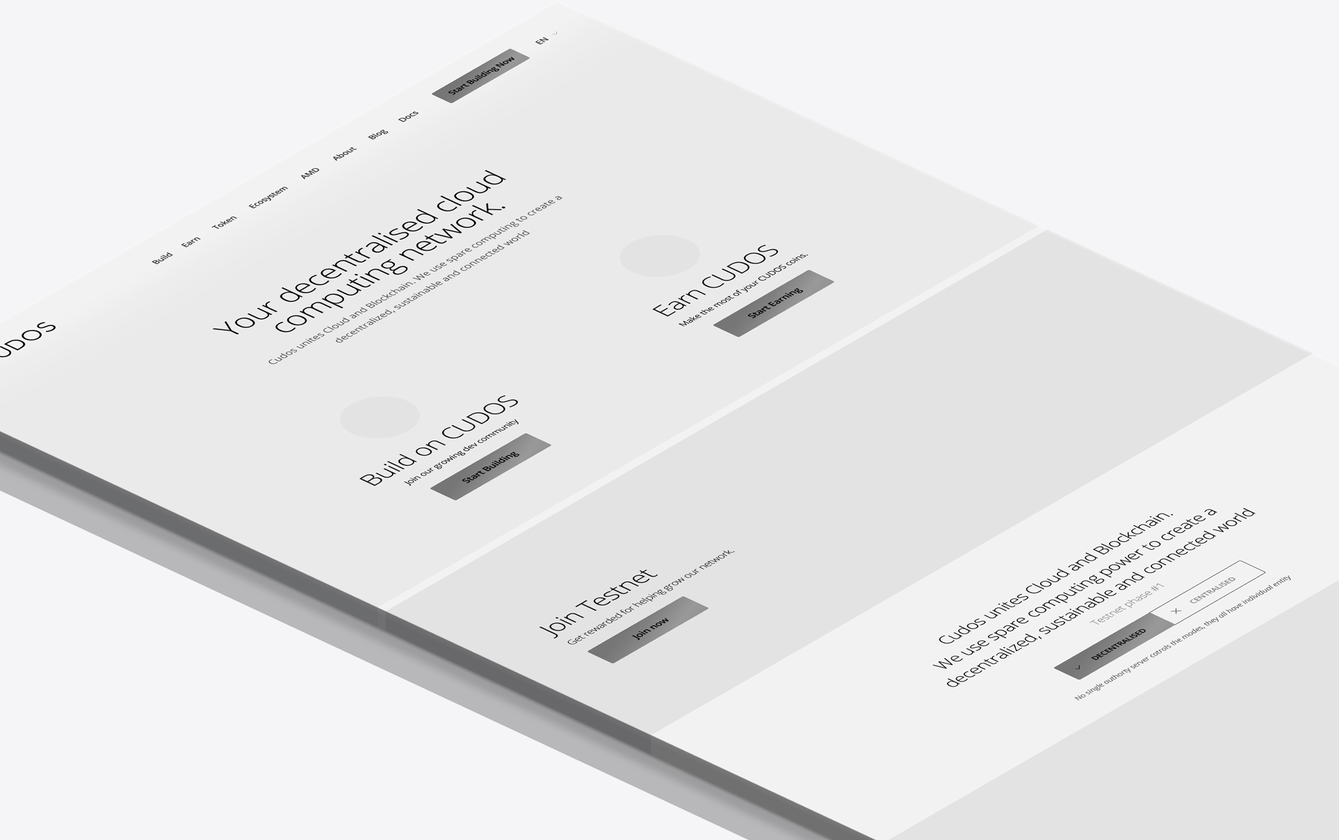
Wireframe Planning
Subtle Motion Effects
Mobile UX
