Overview
My Office POD
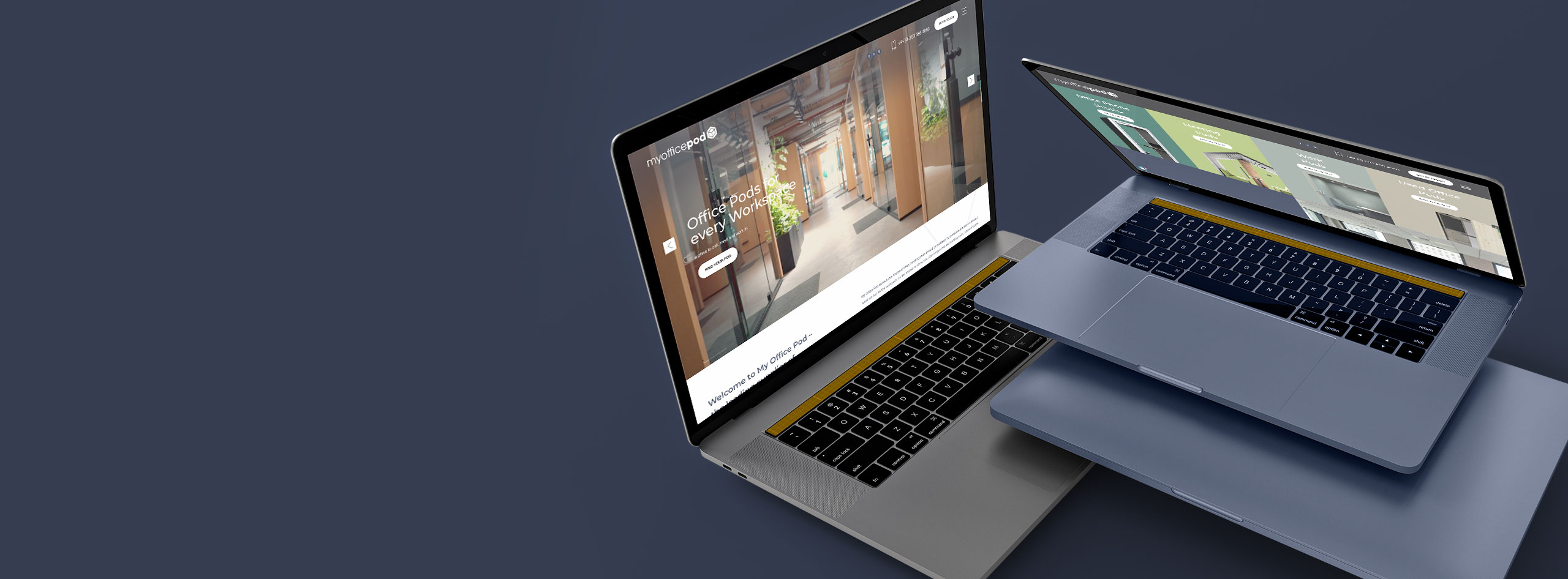
- SEO, UI / UX, WordPress Web Design
- 2019
-
Bespoke Web Design
-
Customised Product Layouts
-
Landing Page System
-
Customised Admin
My Office Pod specialises in providing top-notch meeting pods that are unrivaled in quality and functionality. Their meeting pods offer a perfect solution for creating a private and comfortable space to conduct meetings, brainstorming sessions, or focus work.
Client Brief
The directors of My Office Pod were concerned that the outdated design of their website was impeding their marketing efforts and sales and approached Bond Media to address this. We eagerly accepted their challenges:Project Overview:
Lead time: 7 weeks
Sector: Office Solutions
Target Type: B2C
Demographic: Business Owners
Website Goals: Clean Design, Easy to use Navigation with Clear CTA’s
Services: Custom WordPress Web Design & Development
Key Features:
WordPress Bespoke Development
After fully understanding their objectives we recommended WordPress as the CMS to meet their specific requirements as it offers the flexibility, scalability, and features needed to support their growth plans
Product Management
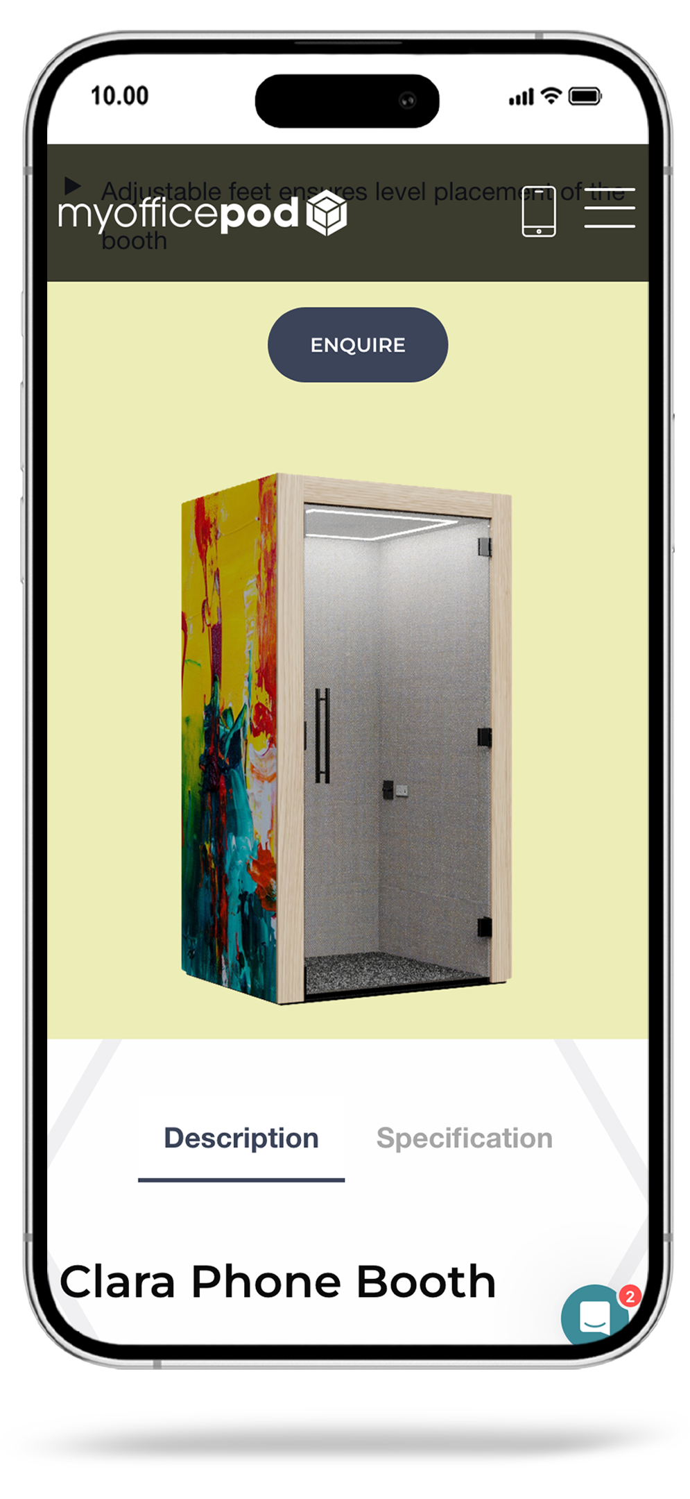
We customised the WordPress publishing system so that the My Office Pod team could easily create product descriptions, and add technical data as well as a breakout area where the key features of each product can easily be read.
Landing Page Builder
The landing page builder we created for My Office Pod means that no programming or HTML skills are required to for targeted campaigns they run. All they need to do is upload images and videos, enter in text and the page comes to life.
Clear Lead Capture
Every product page on the website is strategically designed with a prominent and clear call-to-action, enabling customers to easily make inquiries about the products. The call-to-action prompts visitors to fill out a form, capturing their contact details and specific product interests. To enhance the customer experience and streamline the inquiry process, the form is intelligently structured to record the particular product the customer is interested in.
SEO Administration
Throughout the entire project, we prioritised the SEO requirements, incorporating necessary features and functionalities to optimise search engine visibility. The client can implement Meta Data, review page scores as the content is added. By implementing the appropriate administrative features and adhering to SEO best practices, we ensured that the website would have a strong foundation for search engine rankings and visibility.
Testimonials Manager
My Office Pod’s website offers the client the flexibility to showcase testimonials received from satisfied customers. These testimonials can be featured not only on the home page but also on any other page of their choosing. The client has the ability to upload the wording of the testimonials, along with the respective client logos and the positions held by the individuals providing the testimonials.
The Solution
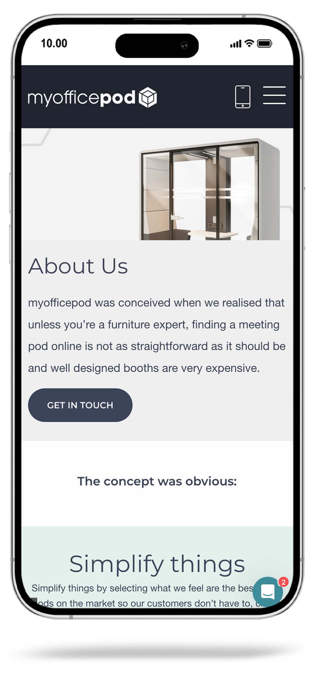
After thoroughly understanding the brief from My Office Pod, we embarked on the task of bringing their vision to life. Through discussion with the team, the site’s key functionality was defined, and wireframes created to determine the optimal positioning for content. A key focus was to enhance the customer experience and create sales funnels with unobtrusive calls to action to maximise enquiries.
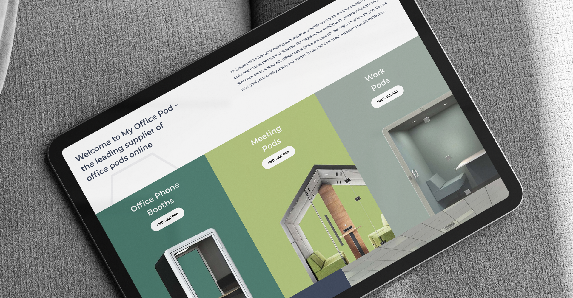
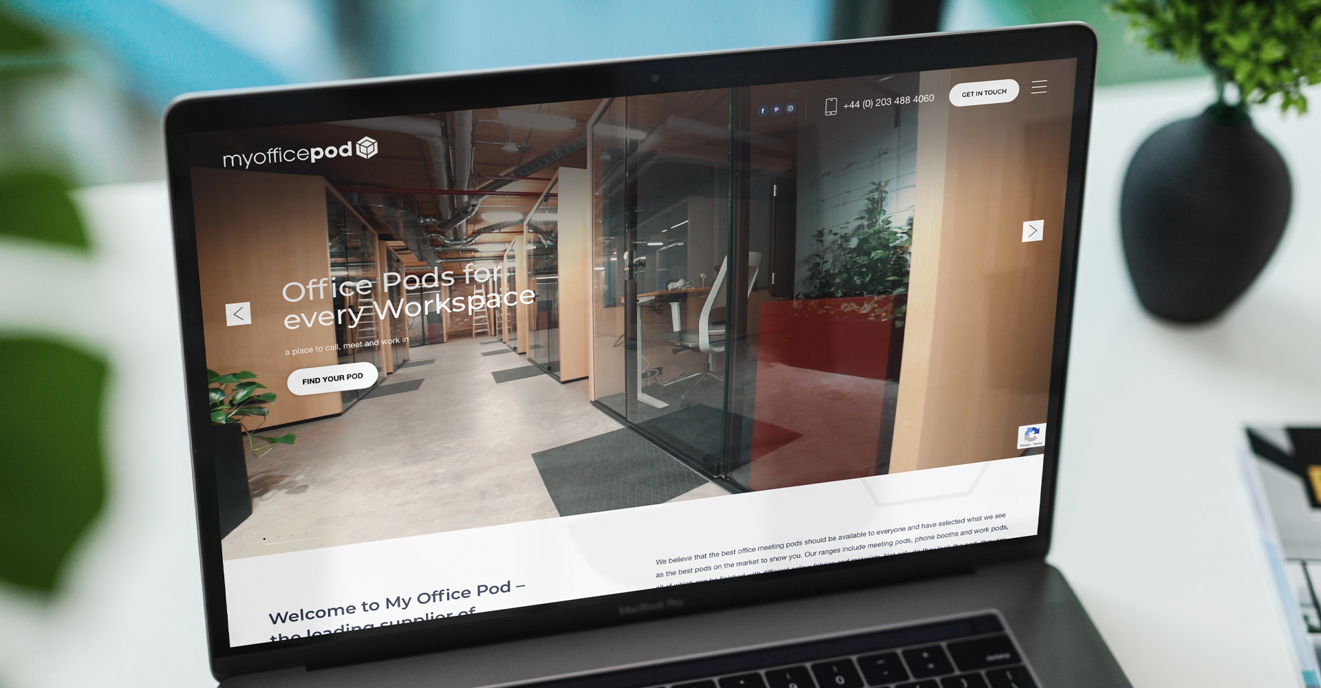
The approved wireframes formed the basis of our visual designs and with careful attention to brand guidelines we ensured that each page layout communicated the professionalism and innovation of My Office Pod.
We chose WordPress as the content management system and customised the admin controls allowing our client to manage and update the website efficiently while creating visually stunning pages.
SEO best practices were adhered to ensuring that the website would have a strong foundation for search engine ranking and market visibility. Need a solution like this? book a discovery call.
Colour Palette
When designing the website for TRONYX, we adhered to the brand's identity by maintaining a clean and straightforward color palette. This approach allowed the product photography to seamlessly incorporate the brand's colours into the site's visual appeal.


Typography
Upon careful examination of the brand guidelines and a thorough understanding of the intended messaging, we proceeded to assess the typography employed in the website design. Subsequently, we made the decision to transition to a web-safe font that aligns with the brand's identity and messaging.
Bespoke User Interface
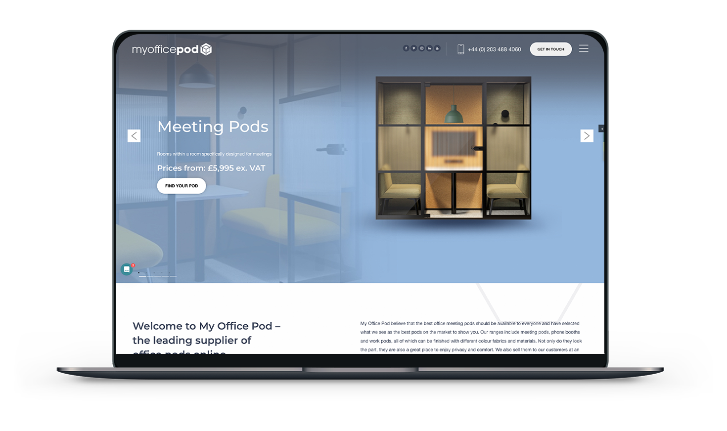
Mobile UX
